

Starter themes give you a complete design and page structure in one step. You can apply a full theme or keep selected parts of your current design.
Browse starter themes
Open Theme gallery to see the available designs. The active theme is labelled Active.
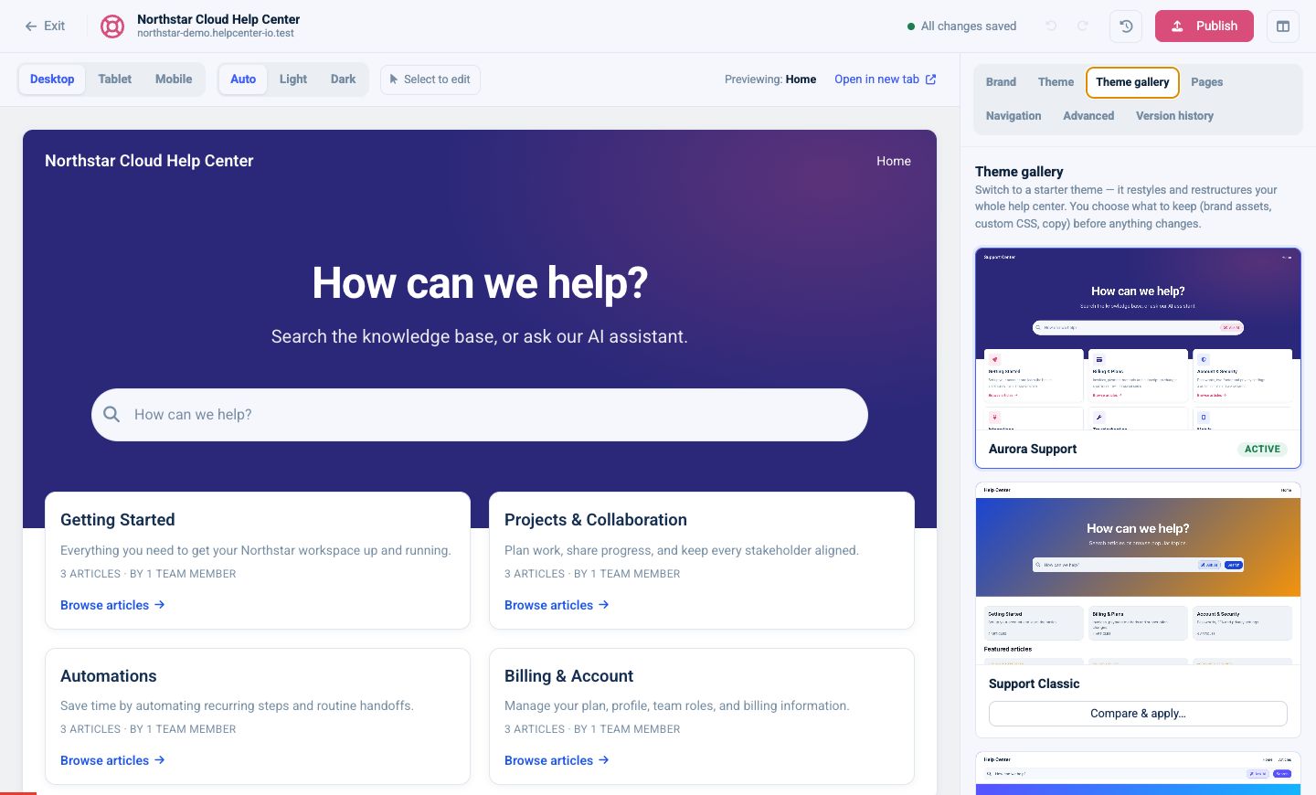
To try another theme:
- Find the theme you want.
- Select Compare & apply….
- Choose which sections to take from the new theme.
- Select Apply theme.
Applying a theme updates your draft and preview. It does not change the live help center until you publish.
Choose what the theme changes
The comparison dialog lets you apply or preserve individual areas, including:
- Brand
- Light-mode colors
- Dark-mode colors
- Fonts
- Corner radius
- Home, Category, Article, Search, Contact, and 404 layouts
- Navigation
- Meta settings
- Custom CSS
Anything you uncheck stays as it is in your current draft.
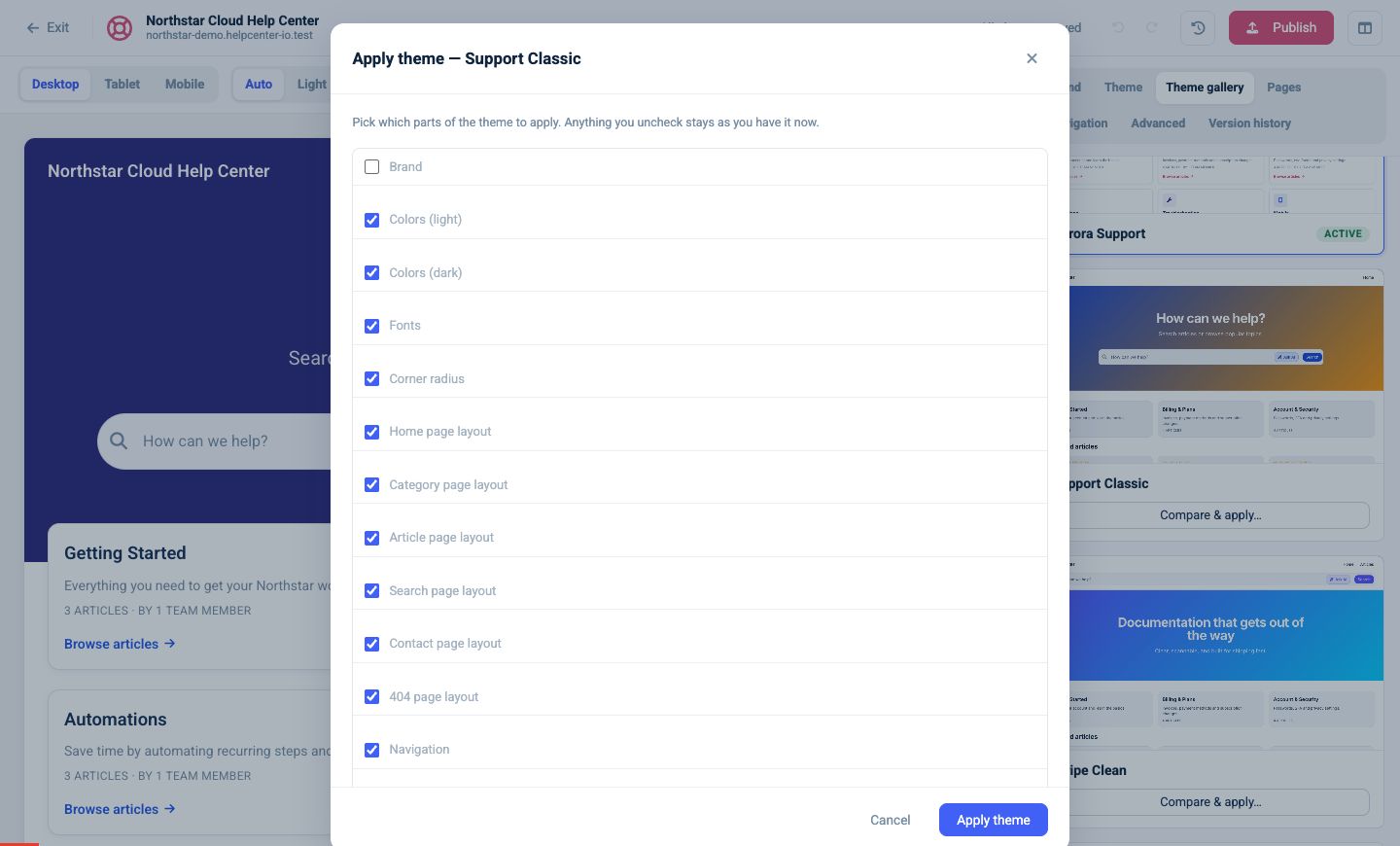
For an established help center, a safe approach is to keep Brand unchecked, apply the new colors and layouts, and review Custom CSS before including it.
Fine-tune the theme
Open Theme after choosing a starter design.
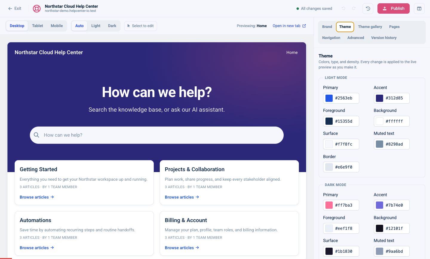
Colors
Light and dark modes each have their own:
- Primary
- Accent
- Foreground
- Background
- Surface
- Muted text
- Border
Enter a hex value or use the color picker. Check contrast in both color modes, especially for text, links, buttons, and borders.
Typography
Choose separate fonts for:
- Body text
- Headings
- Monospace content such as code
Use Browse all… for the full font list. You can also upload self-hosted .woff or .woff2 files and reference them as custom fonts.
Layout feel
Choose Compact, Comfortable, or Spacious density, then adjust small, medium, and large corner radii.
Tips for a consistent design
- Use one strong primary color and one supporting accent.
- Keep body text highly readable in both modes.
- Limit the design to one body font and one heading font unless your brand requires more.
- Check cards and forms after changing corner radius or density.
- Add a short version note when publishing a major theme change.