

Use Hero, Search bar, Container, Spacer, and Divider components to shape a page before adding category, article, or form content. These components control hierarchy and spacing without requiring custom code.
Build a hero
The Hero is a container component. It can display its own heading and subheading and can also hold other components such as a Logo, Navigation, or Search bar.
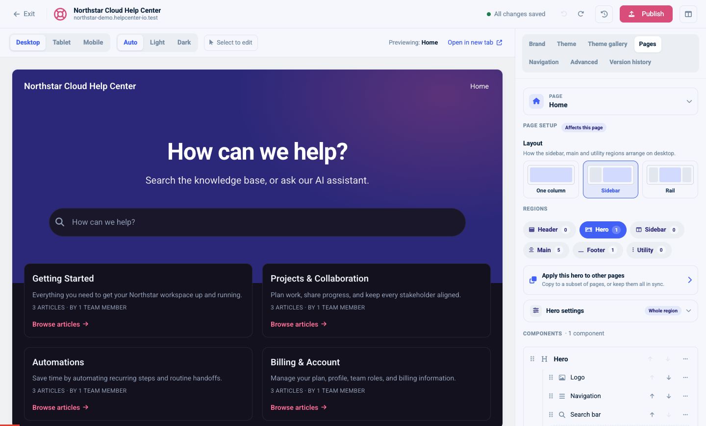
Open the Hero component to set:
- Heading and Subheading
- Align: Left, Center, or Right
- Height: Compact, Standard, or Tall
- Background: Gradient, Solid, or Image
- Text color: Auto, Light, or Dark
Headings and subheadings accept basic formatting such as bold, italic, and line breaks.
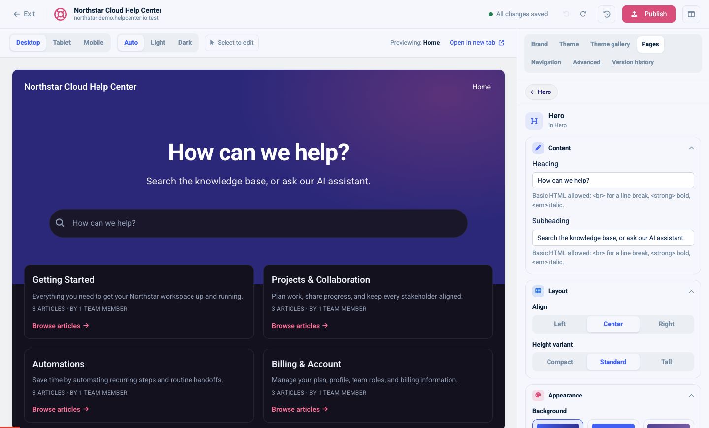
Choose a hero background
For a Gradient, choose linear or radial, then set the start and end colors. A linear gradient also supports an angle.
For a Solid background, choose one color.
For an Image, upload an image or select one from Unsplash. You can set an underlay color and enable a cover overlay with adjustable opacity so the text remains readable.
Use Auto text color for solid and gradient backgrounds when possible. For an image, check both Light and Dark previews and choose Light or Dark text when Auto cannot reliably judge the image.
Arrange components inside a hero
Nested components are listed under Inside Hero. Drag them, or use the up and down controls, to change their order. Select Add inside Hero to add another compatible component.
The Hero component’s alignment controls its content. The Hero region also has whole-region settings for background, padding, border, and supported alignment. Use component settings for the hero design and region settings for the surrounding page area.
Configure a search bar
A Search bar can appear inside a hero, header, or supported page region.
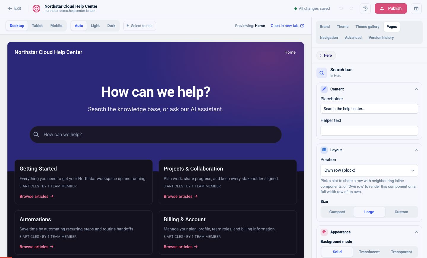
Its options include:
- Placeholder and optional Helper text
- Position: Own row, Inline left, Inline center, or Inline right
- Size: Compact, Large, or Custom
- Background: Solid, Translucent, or Transparent
- Corner radius: from square to fully rounded
- Results: Simple or Detailed
- Instant search
- Show button
Custom size exposes controls for field width and height. Inline positions are most useful when the surrounding row supports inline components. Use Own row when search should be the dominant action.
If Ask AI is enabled for the help center, the Search bar also provides an option to show that action.
Group content in a container
A Container creates a structured box that can hold other components. It is useful for combining two related calls to action, placing content beside a form, or visually grouping a section.
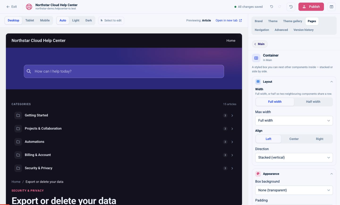
Choose:
- Width: Full or Half in the Main region
- Max width: Full, Readable, or Narrow
- Align: Left, Center, or Right
- Direction: Stacked vertically or Side by side horizontally
- Box background: None, Surface, Muted, or Brand
- Padding: None, Compact, Standard, or Spacious
After adding a Container, add compatible components inside it and reorder them from the nested list. On smaller screens, verify side-by-side content in Tablet and Mobile preview.
Add intentional space
Use a Spacer when two sections need more breathing room than their normal spacing provides.
Choose XS, S, M, L, or XL. Select Custom to set an exact height from 0 to 400 pixels. In the Main region, it can be Full or Half width.
Prefer the preset sizes so spacing stays consistent. Use custom height only to solve a specific layout need, and always check the mobile preview.
Separate sections with a divider
A Divider adds a simple visual boundary between neighboring sections. It has no content settings; in the Main region, choose Full or Half width.
Use a Divider when two sections need visible separation. Use a Spacer when they only need more room. If every component needs a border, consider a Container background instead so the page does not become visually busy.
A reliable page-building order
- Choose the page layout.
- Set whole-region padding and background.
- Add the Hero and configure its appearance.
- Add nested Hero components.
- Use Containers to group related content.
- Add Spacers or Dividers only where the hierarchy needs them.
- Review Desktop, Tablet, Mobile, Light, and Dark previews.
- Publish when the draft is ready.