

Use the Contact page to collect support requests and suggest relevant help articles before a visitor submits the form. The page remains hidden from the live help center until the Contact form has a recipient email.
Add and enable the Contact form
Open Pages, choose Contact, select the Main region, then add or edit Contact form.
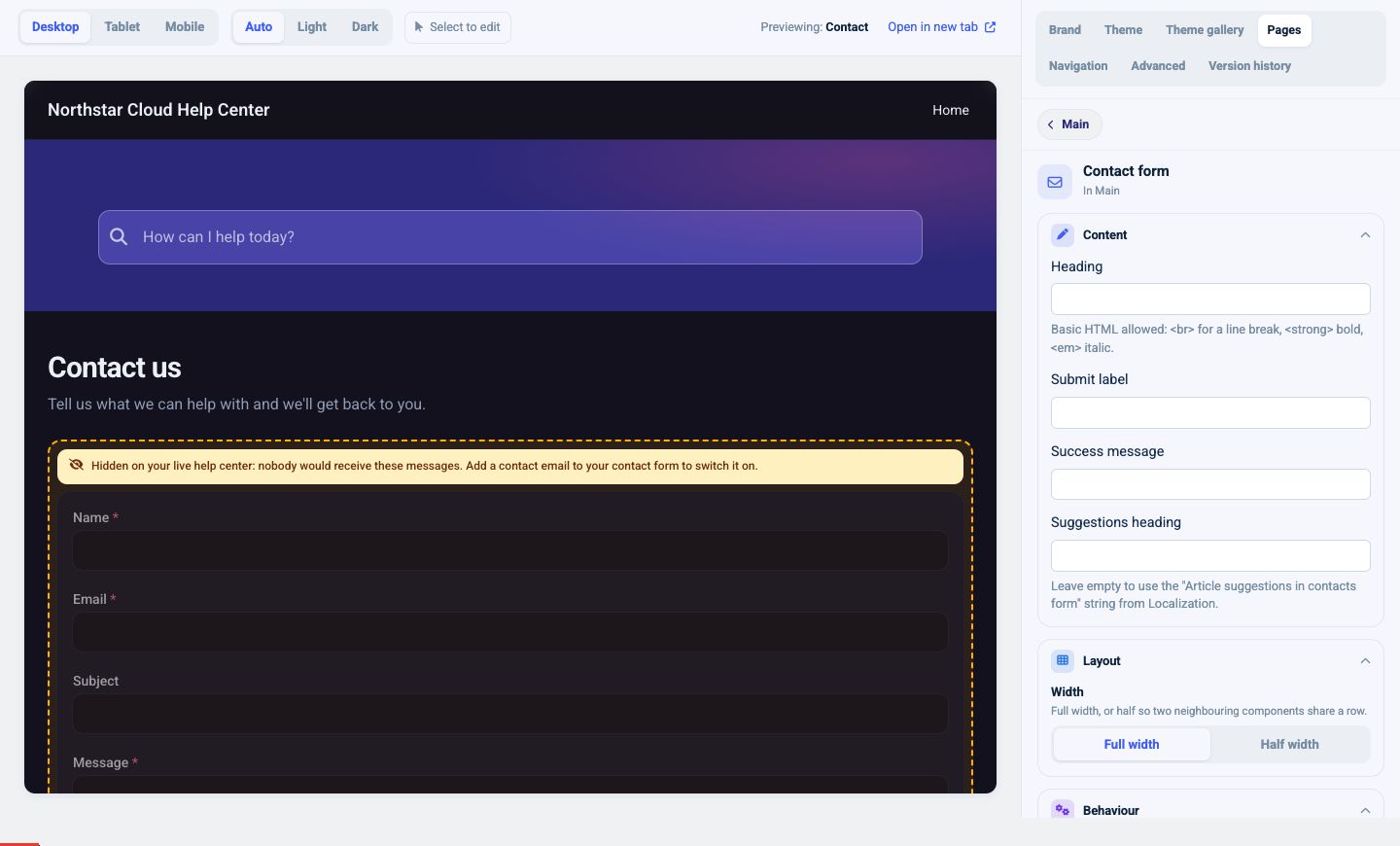
Set:
- Heading
- Submit label
- Success message
- Suggestions heading
- Full or Half width
- Recipient email
The recipient email is required for the live form. If it is empty, the preview warns that the Contact page is hidden because nobody would receive its messages.
Use an inbox that is actively monitored. Send a test request after publishing and verify that it reaches the expected workflow.
Customize form fields
Each field has:
- Label
- Field name
- Type
- Placeholder
- Required setting
Available field types are:
- Single-line text
- Phone
- Multi-line text
- Dropdown
- Checkbox
Use the up and down controls to reorder fields. Remove fields you do not need, and select Add field to create another.
Keep the form short. Name, email, subject, and a multi-line description are enough for many support teams. Add a dropdown only when its value changes how the request is routed or answered.
Field names should be stable and descriptive because they identify the submitted values. Labels and placeholders should tell visitors what information you need without repeating each other.
Suggest articles while visitors type
Enable Suggest articles while typing to show the top three matching help articles as the visitor writes a request.
This can deflect common questions without blocking the visitor from contacting you. Make sure article titles use the same language customers use in support requests so the suggestions are relevant.
Send a confirmation email
Open Advanced, then enable Confirmation email to acknowledge the request automatically. Set the email subject and body.
A useful confirmation should:
- Confirm that the request was received
- Set an honest response-time expectation
- Explain how to add more information
- Avoid promising a resolution before the team has reviewed the request
Test the confirmation with an address outside your organization before relying on it.
Add a Contact CTA elsewhere
The Contact CTA component is a separate call to action that can link visitors to the Contact page or another support destination. It can be used on Home and in supported Main, Utility, or Footer regions.
Configure:
- Heading
- Subtext
- Button label
- Button URL
- Full or Half width
- Start or Center alignment
- Heading icon
The Button URL can be:
- A relative help-center path
- A full external URL
- A
mailto:link
If the URL is empty, the CTA is hidden on the live help center.
Enable Custom content when you need HTML content instead of the standard heading and subtext fields. Keep the button destination clear and use the Contact page rather than mailto: when you need structured fields, article suggestions, or confirmation emails.
Publish and test the complete journey
- Add a monitored recipient email.
- Complete every required field in preview.
- Check article suggestions with a common customer question.
- Publish the draft.
- Open the live Contact page in a private browser window.
- Submit a test request.
- Confirm the team receives it.
- Confirm the visitor receives the expected success message and confirmation email.
- Test the Contact CTA from every page where it appears.
If the page is linked from Navigation, confirm that anonymous visitors can open it after publishing.