

Header, Footer, and Utility regions hold persistent navigation, branding, language controls, social links, and secondary content. They are good candidates for live region sync when the same experience should appear across page types.
Understand links versus components
The editor has two related controls:
- Navigation section: manages the actual header and footer link destinations.
- Navigation component: controls how a set of navigation links is presented inside a page region.
Add, remove, and reorder destinations in the Navigation section. Use the Navigation component’s options to change the presentation.
Configure the Logo component
Use Logo to show either:
- Your uploaded logo image
- The help-center brand name as text
Choose whether it links to the help-center home page or a connected parent website. You can also set its internal alignment and, in a supported inline row, position it left, center, or right.
Use a parent-website link when the help center is part of a larger product site and visitors expect the brand mark to return there. Otherwise, link it to the help-center home page.
Configure the Navigation component
Choose:
- Horizontal
- Vertical
- Pills
You can show subcategories and set an inline position when the containing row supports it. Horizontal navigation is a natural fit for Header. Vertical navigation works better in narrow regions. Pills make a small set of destinations more prominent.
Keep the destinations themselves current in the Navigation section.
Add a Language switcher
For multilingual help centers, the Language switcher can use:
- Dropdown or Inline presentation
- Language name
- Language name with its native name
- Language code
It also supports inline positioning. Use a Dropdown when many locales are available and Inline when the list is short.
Build a custom footer
The Footer component starts with the default brand and navigation. Add custom columns to take control of its content.
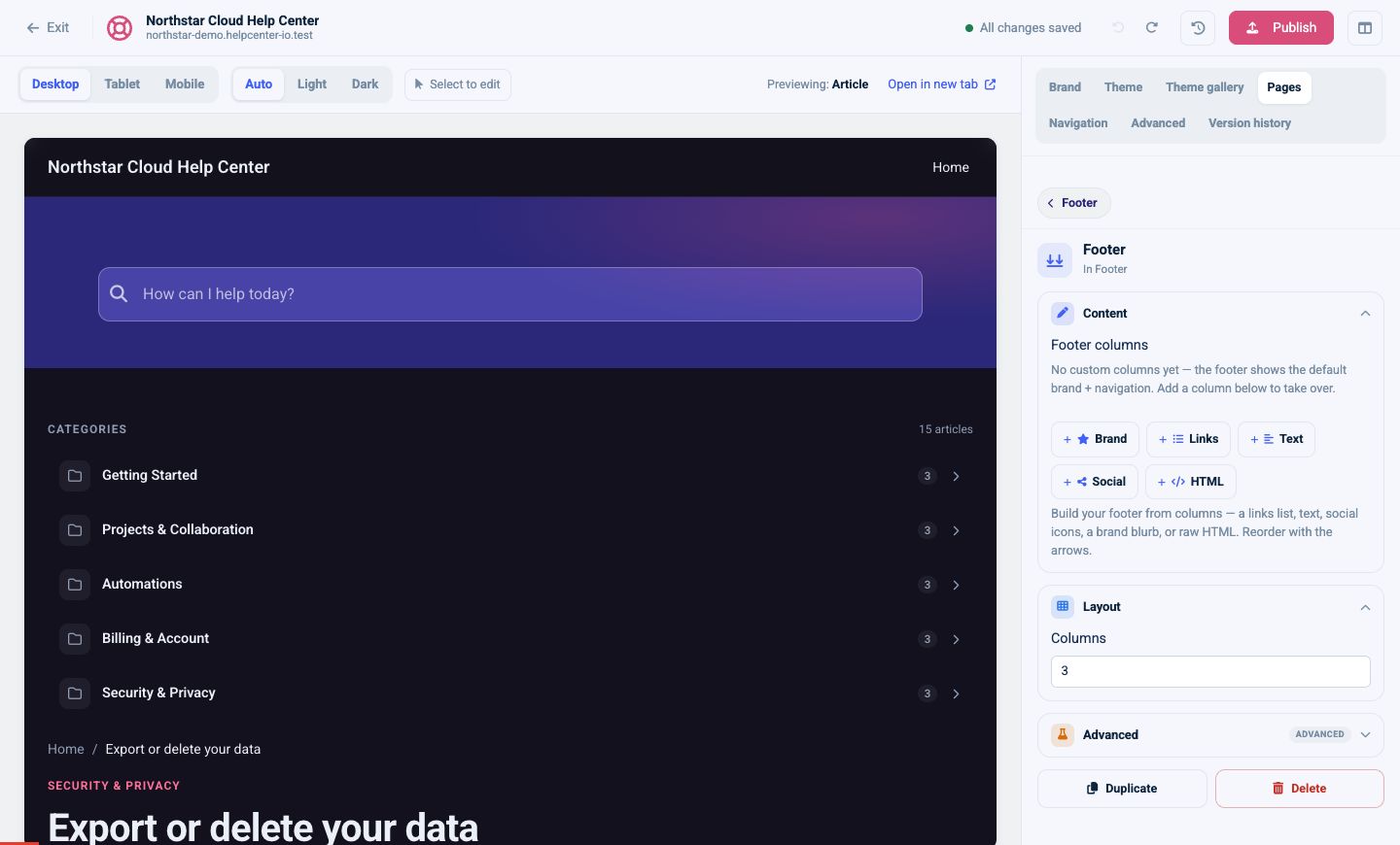
Available column types are:
- Brand: brand identity and supporting copy
- Links: a list of footer destinations
- Text: plain supporting information
- Social: social-network links
- HTML: custom markup
Choose the number of columns, reorder the blocks, and decide whether to show HelpCenter.io attribution. Verify the footer at mobile width; a wide multi-column layout will stack on a smaller screen.
Add Social links
The Social links component can include Twitter, LinkedIn, GitHub, Facebook, Instagram, and YouTube destinations.
Only add networks your organization actively maintains. Open every link from the preview and confirm it leads to the public profile rather than an account-management page.
Use the Utility region for secondary actions
Utility is useful for actions or information that should remain available without competing with the main article or category content. Depending on the page, suitable components include language controls, article export or sharing actions, rich text, and custom content.
Keep essential navigation in Header, primary calls to action in Main or Hero, and truly secondary controls in Utility.
Add Rich text or Custom HTML
Rich text is the safer option for formatted copy, notices, or short instructions. It supports Markdown-style content and Full or Half width in Main.
Use Custom HTML when the content cannot be expressed with standard components. It accepts HTML up to 50 KB and offers Full bleed when the content should reach beyond the normal content width. On multilingual sites, localize the content for each locale.
Custom HTML should not replace ordinary headings, links, or layouts that standard components already support. Standard components remain easier to update and more consistent across screen sizes.
For scripts rather than markup, use the dedicated Custom script controls described in the advanced customization guide.
Sync shared regions
A linked region displays a notice such as Synced across all pages. Edits to that region and its components apply to all linked page types.
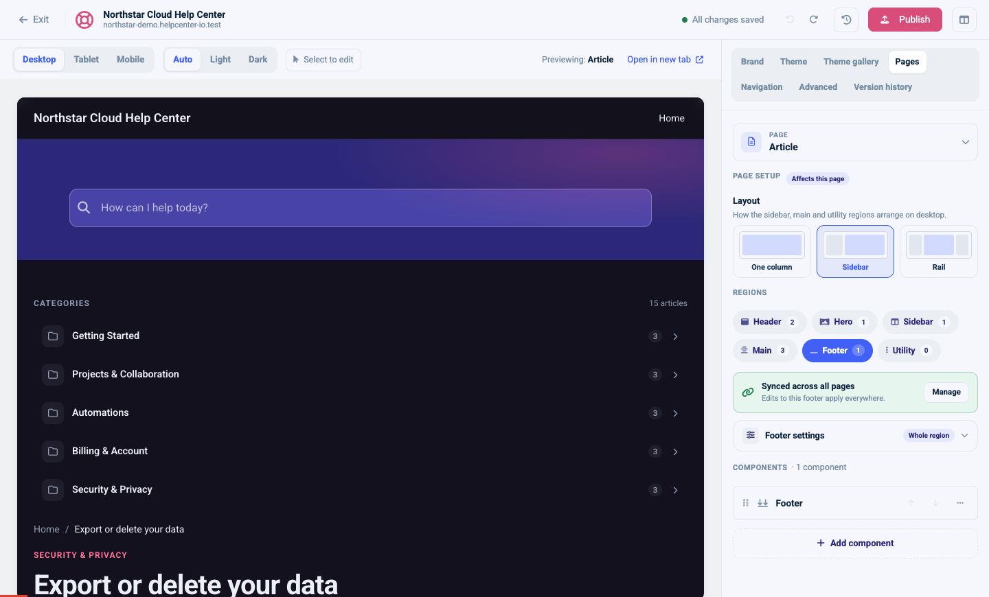
Live sync is usually appropriate for Header and Footer. Use a one-time copy instead when a page needs its own version later.
Before editing a synced region:
- Read the sync notice.
- Check which region and page you are editing.
- Make the component change.
- Preview several linked page types.
- Publish only after the shared result is correct.