

Template Editor v2 includes several ways to help visitors browse content. The best component depends on whether you want to show categories, a general article feed, a curated selection, FAQs, or a complete content tree.
First, distinguish the Category page from a Category grid
The Category page has a built-in article listing. Its settings affect the articles and subcategories inside the category a visitor has opened. This built-in listing cannot be removed or reordered like a component.
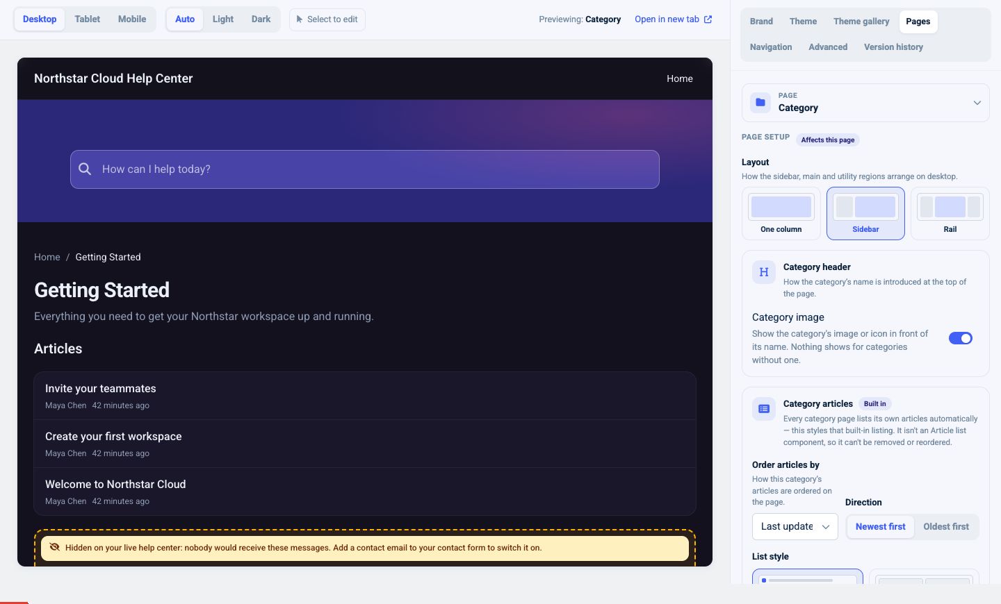
Use its settings to control:
- Category header: show or hide the category image
- Order by: Last updated, Create date, Alphabetically, or Custom
- Direction: newest/oldest or the equivalent direction for the selected sort
- List style: List or Block
- Block columns: one, two, or three
- Item details: Excerpt, Author, Last updated, Reading time, and Leading icon
- Card background
- FAQs: separate FAQ articles into an accordion, or expand them inline
- Subcategories: show or hide them, use Stacked or Grid layout, choose how many articles to show, and expand inline or open the subcategory page
Use Custom ordering when a category follows a deliberate learning sequence. Use Last updated when freshness matters more than sequence.
Use Category grid for a landing-page directory
Add a Category grid when you want to show multiple categories on Home or another supported page.
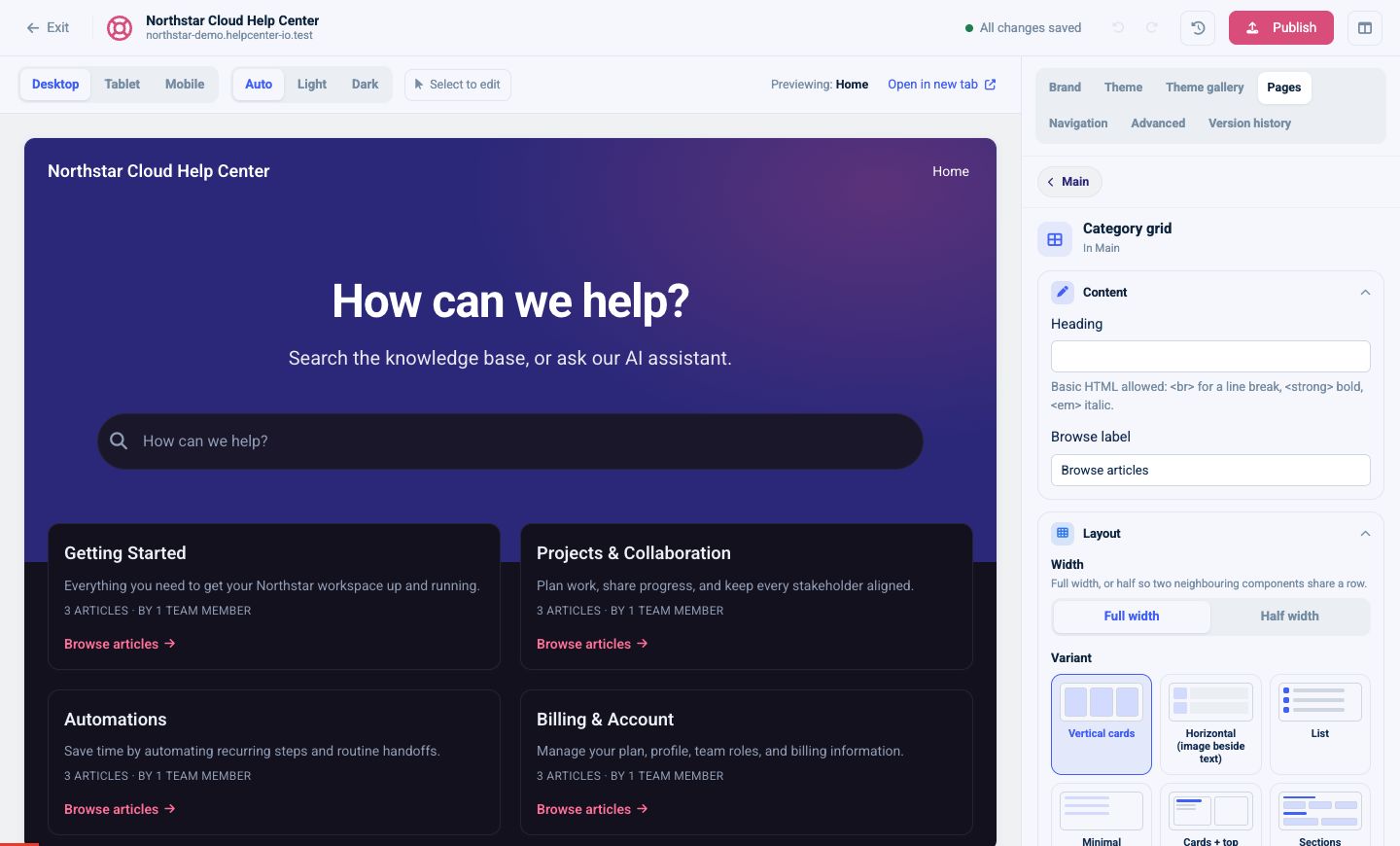
Choose a presentation:
- Vertical cards
- Horizontal: image beside text
- List
- Minimal
- Cards + top articles
- Sections: grouped by parent category
Depending on the variant, you can set columns, spacing, image size, full-width or centered images, and the number of articles shown per category. You can also show:
- Article and subcategory counts
- Browse link
- Description
- Authors and avatars
- Last updated date
Set the category limit to All, 3, 6, 9, or a custom value. The Sections variant also provides heading styles, descriptions, article counts, and handling for parent categories without children.
Use Article list for a broad feed
An Article list displays articles without grouping them by category.
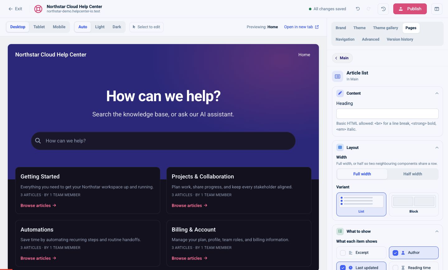
Configure:
- Optional heading
- Full or Half width in Main
- List or Block variant
- One, two, or three columns for Block
- Excerpt, Author, Last updated, Reading time, and Leading icon
- All, 3, 6, 9, or a custom limit
- Sort by recently updated, recently added, manual position, A–Z, or Z–A
- Expand FAQs in the List variant
- Show a background in the List variant
Use Article list for “Latest updates,” “All guides,” or a compact feed. Use Category grid when the category structure itself is the main navigation.
Curate Featured articles
Use Featured articles for a short, intentional set of important content.
Choose:
- Heading
- Full or Half width
- Cards grid or List
- Heading icon
- All, 3, 6, 9, or a custom limit
Select and order the articles you want to feature. If you leave the selection empty, the component falls back to popular articles, which is useful for an automatically maintained section.
Build a focused FAQ section
The FAQs component turns FAQ articles into a focused support section.
Set:
- Heading and optional introduction
- Every FAQ article or a specific FAQ section
- Full or Half width
- Heading icon
- All, 3, 6, 9, or a custom limit
Create separate FAQ sections when different audiences need distinct sets, such as billing questions and administrator questions.
Show the complete hierarchy with Content tree
A Content tree exposes categories and articles as navigable hierarchy.
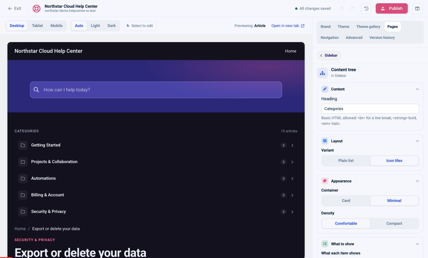
Choose:
- Variant: Plain list or Icon tiles
- Container: Card or Minimal
- Density: Comfortable or Compact
- Whether to show articles, article counts, category icons, and the current item
- Maximum depth
- Collapsible behavior
- Sticky behavior
Content tree works well in a Sidebar for persistent navigation or in Main as a complete directory. Keep the maximum depth low when the hierarchy is large so visitors are not presented with an overwhelming first view.
Recommended combinations
- Home: Category grid + Featured articles + FAQs
- Category: built-in category articles + optional supporting components
- Article sidebar: Content tree for broader browsing
- Search or Not found: Article list or Featured articles to help visitors recover
Avoid placing several large discovery components back to back with the same content. Give each section a clear purpose and heading.