

Custom CSS lets you refine Template Editor v2 beyond the visual controls. Use it for targeted presentation changes such as restyling category cards, emphasizing a navigation link, adjusting article typography, or changing a component at a specific screen size.
Extended Capabilities for Custom CSS Styling
Template Editor v2 has been purpose-built to give you deeper and more flexible styling options than any previous version. Whether you're fine-tuning small visual details or completely reimagining the look of your templates, the new editor provides a stronger foundation for custom CSS to work with.
This means you can now apply styles with greater precision, target specific elements more reliably, and achieve a level of design control that simply wasn't possible before. The underlying structure of the template has been refined to better support custom styling, reducing the workarounds and limitations that often came with earlier versions.
What This Means for You
Greater control over layout, spacing, and typography through custom CSS
More consistent and predictable results when styling individual components
A cleaner structure that makes it easier to target specific elements with your CSS rules
Expanded flexibility to create unique, on-brand designs without fighting default styles
The sections below walk through how to apply custom CSS in Template Editor v2, along with practical examples to help you get the most out of these expanded styling capabilities.
This guide assumes you are comfortable reading CSS selectors and using browser developer tools.
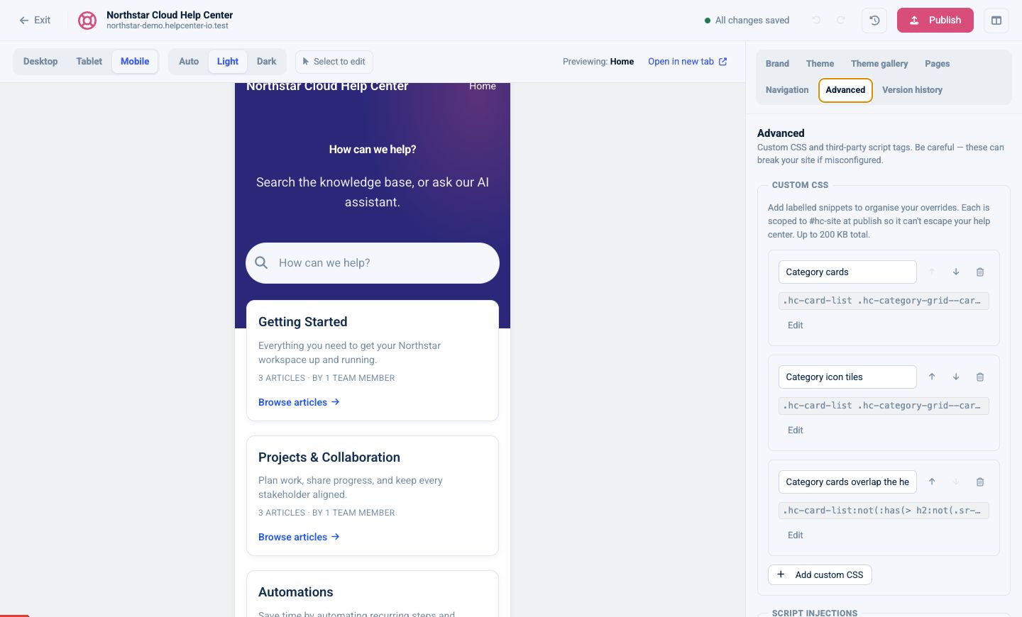
Add and organize Custom CSS
Open Advanced.
Under Custom CSS, select Add custom CSS.
Give the snippet a descriptive label, such as
Category cards.Enter the CSS.
Select Save to collapse the snippet.
Check Desktop, Tablet, Mobile, Light, and Dark previews.
Publish when the complete draft is ready.
Create a separate labeled snippet for each purpose. Snippets can be reordered, disabled without deleting their code, or removed. Enabled snippets are combined in their displayed order, so a later rule can override an earlier rule when their specificity is equal.
The combined Custom CSS limit is 200 KB.
How Custom CSS is scoped
Template Editor v2 automatically scopes every selector to #hc-site. For example, this input:
.hc-article__title {
  letter-spacing: -0.03em;
}
is published with the equivalent scope:
#hc-site .hc-article__title {
  letter-spacing: -0.03em;
}
You normally should not add #hc-site yourself. The extra scope also means a purpose-built .hc-* selector will usually override the default utility classes without !important.
Custom CSS is sanitized in both preview and the published help center:
@import,@charset, and@namespaceare removed.Unsafe JavaScript or HTML data URLs are blocked.
Unbalanced CSS braces cause the CSS to be rejected.
Standalone
html,body,*, and:rootselectors are rewritten to#hc-site.Selectors inside
@mediaand@supportsremain supported and are scoped automatically.@keyframesand@font-facekeep their native structure.
Use the Theme settings or uploaded custom fonts instead of an @import rule.
Choose selectors that are designed for customization
Prefer selectors in this order:
data-hc-regionfor a page regiondata-hc-component-typefor every instance of a componentA purpose-built
.hc-*class for a stable part of a componentdata-hc-instance-idwhen only one component instance should changeA custom class assigned to a navigation link
Avoid generated utility classes, deeply nested element paths, and selectors based on visible text. Those details are more likely to change as the default design evolves.
Region selector reference
Use region selectors when the rule should affect the entire band or column.
Area | Recommended selector |
|---|---|
Header |
|
Hero |
|
Main content |
|
Sidebar |
|
Utility rail or band |
|
Footer |
|
Useful region classes include:
Element | Selector |
|---|---|
Header band |
|
Block header row |
|
Inline header row |
|
Hero band |
|
Hero component |
|
Hero content |
|
Main content wrapper |
|
Sidebar |
|
Utility region |
|
Footer band |
|
Combine a region and component selector to keep a rule narrow:
[data-hc-region="header"] [data-hc-component-type="Navigation"] a {
  font-weight: 600;
}
Component selector reference
Every component in the following table exposes a data-hc-component-type hook. Component names are case-sensitive.
Component family | Selectors |
|---|---|
Brand and navigation |
|
Hero and search |
|
Categories and discovery |
|
Article information |
|
Article actions |
|
Forms and calls to action |
|
Layout and content |
|
Footer |
|
Some simple components do not add a dedicated component wrapper. Use .hc-custom-html for Custom HTML, a surrounding region selector for Divider, and the more specific element hooks below when available.
The Category page’s built-in article listing reuses the Article list markup but is not a component instance. Target it with [data-hc-region="main"] section[aria-labelledby="hc-articles-heading"].
Element selector reference
Categories and article listings
Element | Selector |
|---|---|
Category Grid wrapper |
|
Card grid |
|
Card-style grid |
|
One category |
|
Category header in “Cards + top articles” |
|
Articles inside a category card |
|
“See all” category link |
|
Parent-category sections |
|
Subcategory collection |
|
One subcategory card |
|
Subcategory title |
|
One tracked article link |
|
Article pages
The article classes below are stable Custom CSS hooks.
Element | Selector |
|---|---|
Article wrapper |
|
Article header |
|
Category eyebrow |
|
Article title |
|
Article body |
|
Metadata row |
|
Author |
|
Updated date |
|
Reading time |
|
Metadata separator |
|
Rating component |
|
Rating buttons |
|
Comments |
|
Export menu |
|
Share buttons |
|
Table of contents |
|
Search, forms, and navigation
Element | Selector |
|---|---|
Search submit button |
|
Ask AI button |
|
Instant-search dropdown |
|
Search results |
|
Search-bar AI answer |
|
Contact form |
|
Article suggestions |
|
Contact CTA |
|
Contact CTA button |
|
Content tree |
|
Current content-tree item |
|
Language dropdown |
|
Inline language links |
|
Light-mode logo image |
|
Dark-mode logo image |
|
Formatted article or rich text |
|
Custom HTML |
|
Theme variable reference
Use theme variables instead of fixed colors where possible. They automatically follow the configured Light and Dark palettes.
Purpose | Variable |
|---|---|
Primary brand color |
|
Accent color |
|
Main text |
|
Page background |
|
Muted text |
|
Raised surface or card |
|
Borders |
|
Automatic Hero text |
|
Small, medium, and large radius |
|
Pill radius |
|
Body, heading, and code fonts |
|
Theme spacing |
|
Theme H1 size |
|
Example:
.hc-contact-cta {
  background: var(--hc-color-surface);
  border: 1px solid var(--hc-color-border);
  border-radius: var(--hc-radius-lg);
  color: var(--hc-color-fg);
}
Example: restyle the category boxes
This example gives vertical and horizontal category cards a quieter border, stronger shadow, and lifted hover state:
[data-hc-component-type="CategoryGrid"] .hc-category-grid--cards > li > a {
  background: var(--hc-color-bg);
  border: 1px solid var(--hc-color-border);
  border-radius: calc(var(--hc-radius-lg) + 0.25rem);
  box-shadow: 0 2px 8px rgb(15 30 60 / 8%);
  transition:
    border-color 150ms ease,
    box-shadow 150ms ease,
    transform 150ms ease;
}

[data-hc-component-type="CategoryGrid"] .hc-category-grid--cards > li > a:hover {
  border-color: var(--hc-color-primary);
  box-shadow: 0 10px 28px rgb(15 30 60 / 14%);
  transform: translateY(-3px);
}

@media (prefers-reduced-motion: reduce) {
  [data-hc-component-type="CategoryGrid"] .hc-category-grid--cards > li > a {
    transition: none;
  }

  [data-hc-component-type="CategoryGrid"] .hc-category-grid--cards > li > a:hover {
    transform: none;
  }
}
Because the example uses theme variables, the cards remain compatible with both appearance modes.
The preview below shows the card rule applied, including the lifted hover state on the middle card.

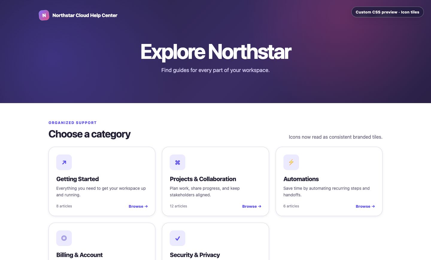
Example: turn category icons into tiles
Font icons and uploaded images use different elements. Style both when categories can use either format:
[data-hc-component-type="CategoryGrid"] .hc-category-grid--cards > li > a > i,
[data-hc-component-type="CategoryGrid"] .hc-category-grid--cards > li > a > img,
[data-hc-component-type="CategoryGrid"] .hc-category-grid--cards > li > a > span > i,
[data-hc-component-type="CategoryGrid"] .hc-category-grid--cards > li > a > span > img,
[data-hc-component-type="CategoryGrid"] .hc-cat-head > i,
[data-hc-component-type="CategoryGrid"] .hc-cat-head > img {
  width: 3.25rem;
  height: 3.25rem;
  border-radius: var(--hc-radius-md);
}

[data-hc-component-type="CategoryGrid"] .hc-category-grid--cards > li > a > i,
[data-hc-component-type="CategoryGrid"] .hc-category-grid--cards > li > a > span > i,
[data-hc-component-type="CategoryGrid"] .hc-cat-head > i {
  display: inline-flex;
  align-items: center;
  justify-content: center;
  background: color-mix(in srgb, var(--hc-color-primary) 12%, transparent);
  color: var(--hc-color-primary);
  font-size: 1.25rem;
}

[data-hc-component-type="CategoryGrid"] .hc-category-grid--cards > li > a > img,
[data-hc-component-type="CategoryGrid"] .hc-category-grid--cards > li > a > span > img,
[data-hc-component-type="CategoryGrid"] .hc-cat-head > img {
  object-fit: contain;
  padding: 0.5rem;
  background: var(--hc-color-surface);
}
The icon treatment creates a consistent branded tile without changing the category content or card layout.
Example: change category spacing on smaller screens
@media (max-width: 640px) {
  [data-hc-component-type="CategoryGrid"] .hc-category-grid {
    gap: 0.875rem;
  }

  [data-hc-component-type="CategoryGrid"] .hc-category-grid--cards > li > a {
    padding: 1rem;
  }
}
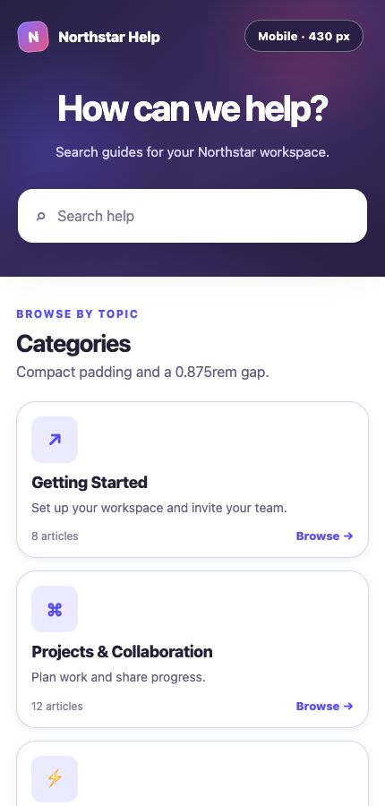
Test media-query changes in Mobile preview and on a real phone before publishing.
Example: style the article title
.hc-article__title {
  max-width: 22ch;
  font-size: clamp(2.25rem, 6vw, 4.5rem);
  line-height: 1.02;
  letter-spacing: -0.04em;
}
The clamp() value keeps the title responsive without separate desktop and mobile rules.
Example: hide the author site-wide
Use the component toggle when a single Article metadata component should change. Use CSS when the author must be hidden across every article layout:
.hc-article-meta__author,
.hc-article-meta__author + .hc-article-meta__sep {
  display: none;
}
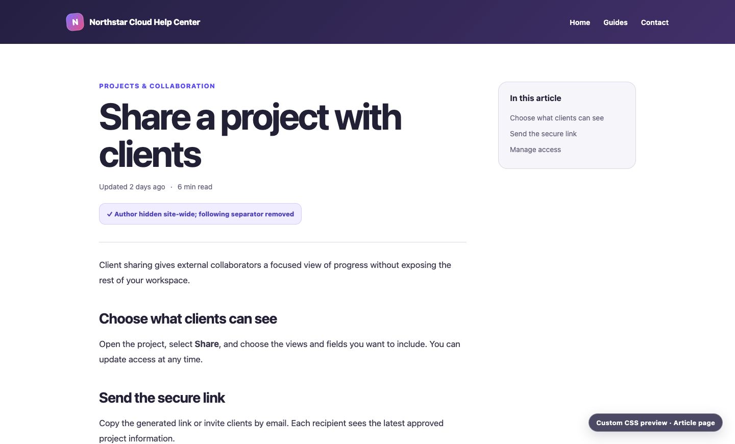
The second selector removes the separator that immediately follows the author.
The preview below combines the responsive title rule with the site-wide author removal so you can see the resulting Article page hierarchy.
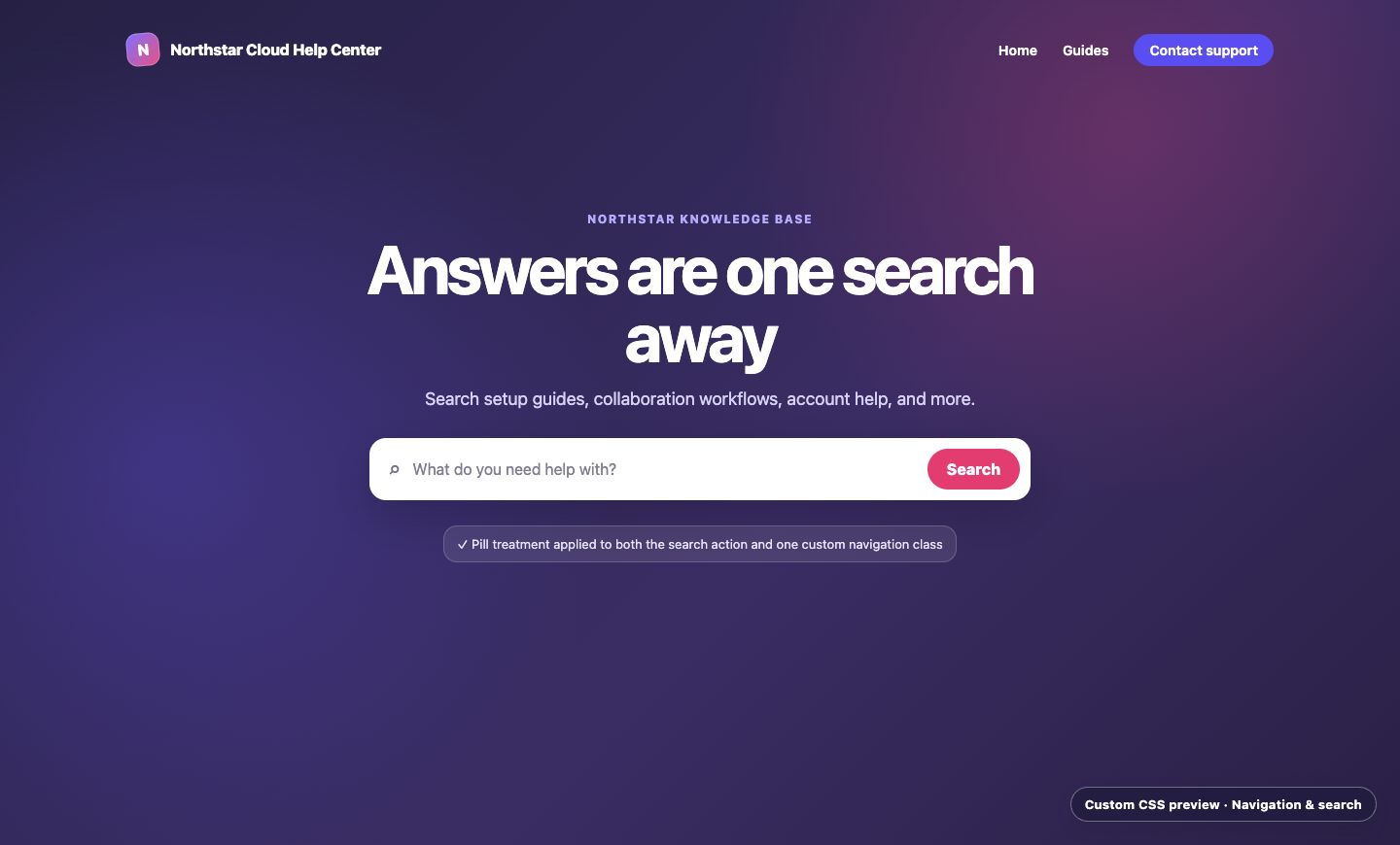
Example: customize the search button
.hc-search-submit {
  background: var(--hc-color-accent);
  border-radius: var(--hc-radius-pill);
  padding-inline: 1.25rem;
}

.hc-search-submit:hover {
  filter: brightness(1.08);
}
Keep a visible focus style when changing buttons. Do not remove outlines unless you replace them with an equally clear keyboard-focus treatment.
Example: emphasize one navigation link
In Navigation, add a CSS class such as support-cta to the link. Then target that class:
[data-hc-component-type="Navigation"] .support-cta {
  display: inline-flex;
  align-items: center;
  border-radius: var(--hc-radius-pill);
  background: var(--hc-color-primary);
  color: white;
  padding: 0.5rem 1rem;
}

[data-hc-component-type="Navigation"] .support-cta:hover {
  color: white;
  opacity: 0.88;
}
This is more durable than selecting a link by its URL, position, or label.
The preview below combines this navigation treatment with the earlier search-button example.
Target one component instance
Most configurable components expose a data-hc-instance-id value. Use it when two instances of the same component type need different styling:
[data-hc-instance-id="YOUR_INSTANCE_ID"] {
  max-width: 48rem;
  margin-inline: auto;
}
Find the value with your browser’s developer tools and confirm it is present on the rendered component. An instance ID belongs to that component; deleting and re-adding the component creates a different target. Prefer component-type selectors when all instances should share the rule.
Troubleshoot a rule that does not apply
Confirm the snippet is enabled.
Check that every opening brace has a closing brace.
Inspect the element and verify the selector exists on the current component variant.
Avoid
html,body, and:root; Custom CSS is scoped inside#hc-site.Replace fixed colors with the
--hc-*theme variables and check Dark preview.Check whether a later snippet overrides the rule.
Increase selector specificity by adding a region or component hook before using
!important.Test hover, focus, open, selected, empty, and mobile states.
Publish only after checking representative Home, Category, Article, Search, Contact, and Not found pages.
If applying a new Theme also applies its Custom CSS, review your labeled snippets afterward. Theme CSS and your overrides may intentionally target the same hooks.