

The live preview updates as you edit, so you can check the design before visitors see it.
Switch device size
Above the preview, select:
- Desktop
- Tablet
- Mobile
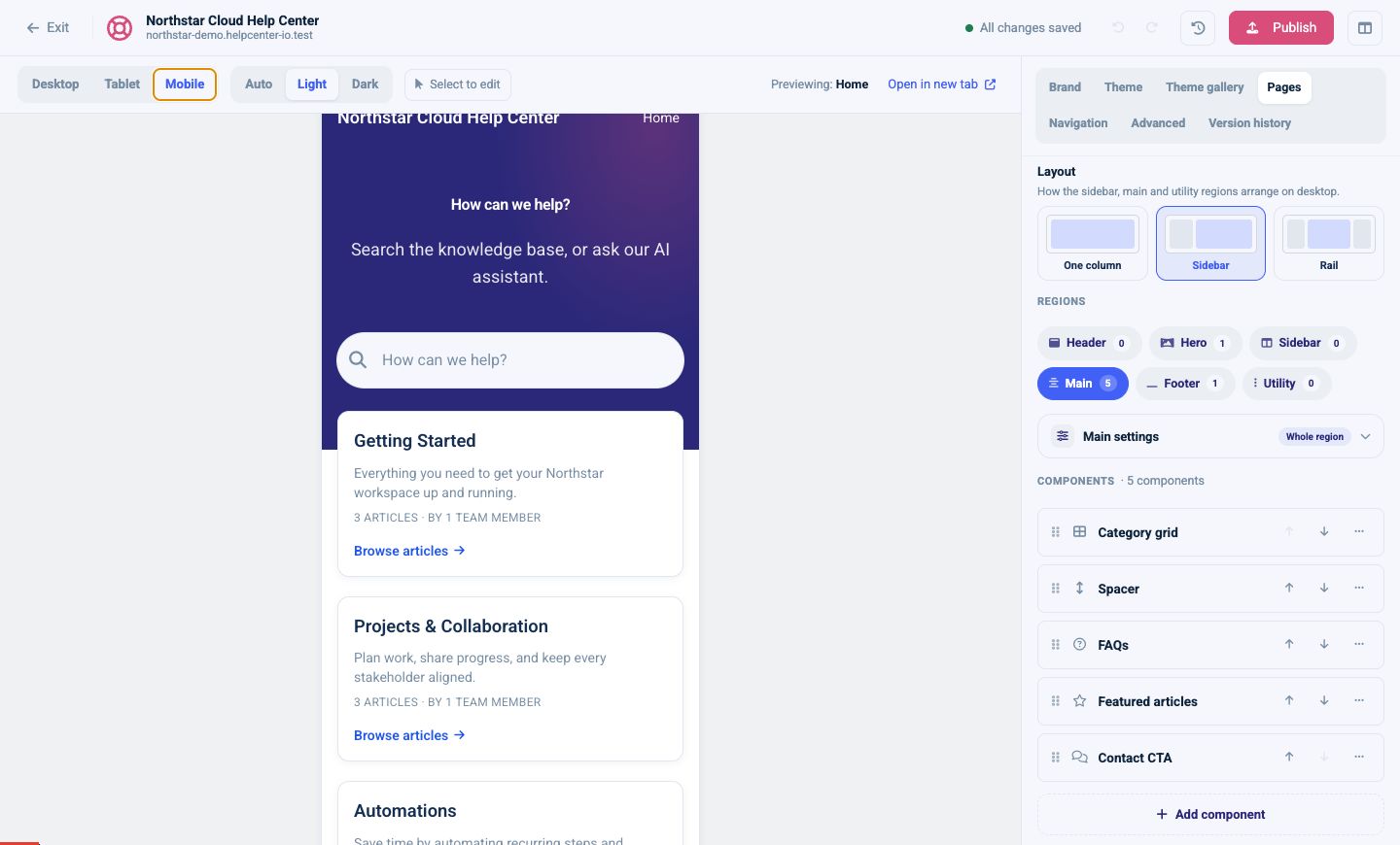
The preview changes width without changing your page settings. Desktop layout choices such as Sidebar or Rail automatically collapse for smaller screens.
Check for:
- Long site, category, and article titles
- Navigation wrapping or collapsing
- Cards that become too narrow
- Images wider than the content area
- Tables and code blocks that need horizontal scrolling
- Buttons that are hard to tap
Switch color mode
Select:
- Auto: follow the operating-system preference
- Light: force the light palette
- Dark: force the dark palette
Check text contrast, borders, form controls, logos, images with transparency, and any custom CSS in both forced modes.
Open a larger preview
Select Open in new tab to view the current page without the settings panel. This is useful for:
- Checking the full page from top to bottom
- Testing navigation and links
- Reviewing with another team member
- Confirming the design at the browser’s normal width
The new-tab preview still represents the draft. It is not the public live page.
Select an element to edit
Select Select to edit, then choose an element in the preview. The editor opens the matching page, region, or component settings when that element supports direct editing.
Use this when you can see what needs to change but do not know which settings panel controls it.
Preview representative pages
Do not stop at the Home page. Check:
- A category with many articles
- An article with headings, lists, images, tables, callouts, and code
- Search results with both short and long titles
- Contact
- Not found (404)
For a multilingual help center, repeat the checks with the longest translated copy.