

The Pages section has three levels of customization: the page, a region on that page, and the individual components inside the region. Knowing which level you are editing helps you predict where a change will appear.
Scope at a glance
| What you edit | Where the change appears |
|---|---|
| Page layout | Only on the selected page type |
| Region settings | In the selected region on the current page |
| A component | In that component instance |
| Copy a region to other pages | On the pages you select, as separate copies |
| Keep a region in sync | On every page linked to that region |
Your changes are saved to the draft as you work. Visitors do not see them until you select Publish.
Page scope: choose the overall layout
Use the page picker to choose Home, Category, Article, Search, Contact, or Not found. The One column, Sidebar, and Rail layout choices display an Affects this page badge.
For example, switching the Article page to Sidebar does not switch the Home or Category page. This makes it possible to give reading pages a focused layout while keeping the landing page wide and visual.
Region scope: style one area of a page
Each page is divided into Header, Hero, Sidebar, Main, Footer, and Utility regions. Not every region needs to contain a component.
Open a region, then expand its settings marked Whole region to control:
- Background: override the region background color
- Padding: None, Compact, Standard, or Tall
- Border below: add a divider below the region
- Content alignment: Left or Center in regions that support it, such as Hero
These controls style the selected region as a whole. They do not change the background or spacing inside an individual card or component.
Component scope: edit one content block
Select a component name to open its options. These settings apply to that component instance. For example, changing a Search bar placeholder on the Home page does not change a separate Search bar on the Article page unless the containing region is linked.
In the Main region, many components also have Full width and Half width options. Two neighboring half-width components can share a row. Components in other regions use the space available to that region.
Reuse a region on other pages
When a header, hero, footer, or other reusable region should appear on more than one page, open Apply this [region] to other pages. Choose the destination pages, then choose how they should be related.
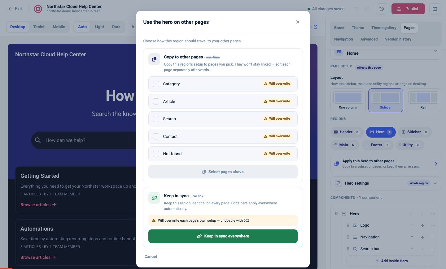
Copy to other pages · one-time
Choose this when the pages should start with the same region but may diverge later.
- The current region setup is copied to the selected pages.
- Each destination receives its own independent copy.
- Later edits on one page do not update the others.
This works well when several pages need the same starting hero but will eventually have different headings or components.
Keep in sync · live link
Choose this when the region should stay identical everywhere it is linked.
- The selected pages share the same region setup.
- Later edits propagate to the linked pages automatically.
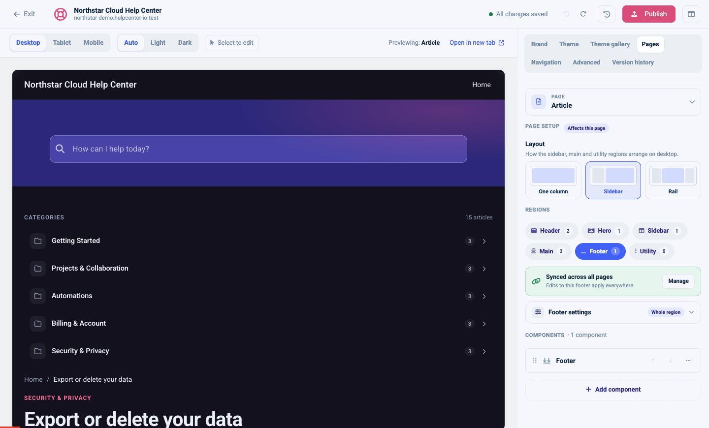
- The editor labels linked regions so their scope is visible.
This is usually the best choice for a consistent header or footer.
Check the overwrite warning
Both actions replace the destination pages’ existing setup for that region, including its components and region styling. The dialog identifies each selected page with Will overwrite.
Before you continue:
- Preview the destination pages.
- Note any page-specific components you need to preserve.
- Select only the pages that should receive the new region.
- Choose one-time copy or live sync.
- Review the affected pages before publishing.
The editor’s Undo control can reverse the most recent draft action. It is still best to confirm the target pages before applying a region broadly.
Choose the right scope
- Change the page layout when the whole page needs a different structure.
- Change region settings when an entire horizontal or side area needs spacing, color, alignment, or a divider.
- Change a component when only that block’s content or presentation should change.
- Use a one-time copy to create similar but independent pages.
- Use a live link for elements that must remain consistent.