

Make your help center feel like your brand: set its colors for light and dark mode, pick the fonts, and choose how roomy the layout is. The preview updates as you go, and visitors see the result once you publish.
Who can do this: Owners and Admins (Editors through Customize on your help center) · Plans: All plans
Change colors, fonts and spacing
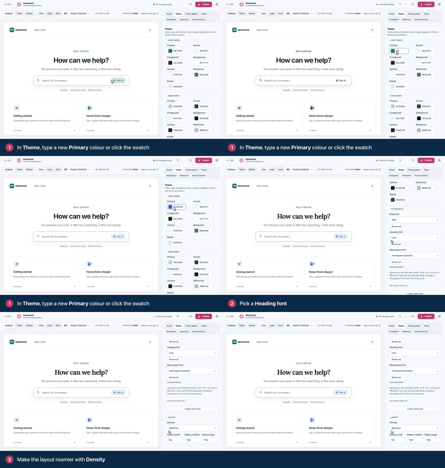
In the template editor, open the Theme tab (⌘2).
Under Light mode, click the swatch next to Primary and pick a color, or type a hex code such as #24644f.
Under Typography, choose a Heading font.
Under Layout, set Density to Compact, Comfortable or Spacious.
Check the preview in both Light and Dark appearance, then click Publish.
Your colors
Light mode and Dark mode each have their own set of seven colors. Visitors see the dark set when they view your help center in dark mode.
Color | Where it's used |
|---|---|
Primary | Your main brand color: buttons, links, highlights and the hero background. |
Accent | A second brand color. The hero's default gradient runs from Primary to Accent, and a few small labels use it. |
Foreground | The main text color. |
Background | The page background. |
Surface | Cards, panels and other raised areas. |
Muted text | Secondary text such as breadcrumbs, dates, descriptions and footer text. |
Border | Dividers and outlines. |
Colors stay readable automatically
Your colors are used exactly as you pick them for buttons, bands and backgrounds. Where a color is used for text, HelpCenter.io checks that it's readable and, if it isn't, makes it only as much darker or lighter as needed:
Muted text is kept readable on your background and surface colors.
Text on buttons filled with your primary color turns black or white, whichever reads better.
Links and labels in your primary or accent color are adjusted when they'd be too faint as text.
Outlines of text fields are kept clearly visible.
So if a text color on your live site looks slightly different from the one you typed, that's why. See How accessible is my help center? for more.
Your fonts
Under Typography, set three fonts:
Body font for your articles and most text.
Heading font for titles and headings.
Monospace font for code.
Each list starts with popular fonts such as Inter, Roboto, Lora and Merriweather. For more, click Browse all…, search by name or filter by Sans-Serif, Serif, Display, Mono or Handwriting, and click Use on the font you want.
Fonts load from Bunny Fonts (fonts.bunny.net). On a slow connection, text can show in a fallback font for a moment while your font loads. That's normal.
Upload your own font
Have a brand font? Owners and Admins can upload it and use it like any other font.
In the Theme tab, find Custom fonts and click + Add custom font.
Enter a Font name, for example the name of your brand font.
Under Styles, pick the weight and whether the style is Normal or Italic, then click Choose files and select its font file.
For each further weight or italic, click + Add another style and do the same.
Click Upload font.
Under Typography, open Body font, Heading font or Monospace font and pick your font from the Your fonts group. It's also at the top of Browse all…
The preview shows your font right away, and readers see it once you publish.
Files: .woff2, .woff, .ttf or .otf, up to 2 MB each.
One style per weight and slant. Upload at least the weights your text uses, usually a regular and a bold. To cover older browsers, add a .woff2 and a .woff of the same style together.
Where it's used: each font in the list shows its styles and whether it's used for Body, Heading or Monospace.
To delete a font, click Remove font next to it and confirm. Its files are deleted, so any text that still uses it falls back to a system font, on your published help center too. Pick another font first, and publish.
Spacing and corners
Density sets the space between and inside sections and cards, and the size of page titles. Compact fits more on the screen; Spacious gives everything more room.
Radius small, Radius medium and Radius large set how round the corners of fields, buttons, cards and panels are. Enter a size such as 8px, or 0px for square corners.
Planning to try other themes? Do that first. Applying a theme replaces your colors, fonts, corners and density unless you untick them. See Choose a theme.
Troubleshooting
My help center still shows the old colors. Your changes are in the draft. Click Publish, then refresh your help center.
Dark mode looks wrong. Dark mode uses its own colors. Set them under Dark mode, and switch the preview's Appearance to Dark to check them. See Light and dark mode.
"Each font file must be 2 MB or smaller." Use the .woff2 version of the font, which is the smallest.
I can't add a custom font. You see "Only site admins can upload or remove custom fonts." Ask an Owner or Admin to upload it and set it under Typography.
My logo disappears on the dark background. Upload a light version as your dark-mode logo. See Add your logo, favicon and brand name.
Comments
Be the first to comment.