

HelpCenter.io comes with 17 themes. Each one sets your colors, fonts, spacing and page layouts in one go, and you can change any of it afterwards. Here's what each theme looks like and who it suits, in the order you'll find them in the Theme gallery.
Who can do this: Owners and Admins (Editors through Customize on your help center) · Plans: All plans, with every theme included
See screenshots of each theme
Every theme except Blank Slate has its own page with screenshots of the home, category, article and search pages, dark mode and a phone. Browse them at helpcenter.io/knowledge-base-templates.
The themes
Theme | What it looks like | Good for |
|---|---|---|
Compass | The default theme for new help centers. Calm green, a search-first home page with category cards, a light and dark switch in the header, and three-column articles with an "On this page" outline. | SaaS and product teams, and long how-to guides. |
Aurora Support | A pink and indigo gradient hero with your logo, menu and a large search box. The home page brings categories, FAQs, trending articles and a contact prompt together. | Support teams that want answers, FAQs and contact on one page, and help centers that use AI Answers. |
Support Classic | The familiar helpdesk look: a gradient hero with a big search box, category cards, featured articles and a contact form at the foot of the home page. On multilingual help centers, a language switcher sits in the header. | Teams that take requests through the help center, and help centers in more than one language. |
Stripe Clean | Crisp and documentation-first: search in the header, a bright blue gradient hero, and articles with your documentation tree docked beside them and an outline on the right. | Product and developer documentation. |
Notion Airy | Spacious and quiet: a simple list of categories, and articles with a page tree in the sidebar and a "Jump back in" list of recent reads. | Long guides and tutorials, and readers who come back often. |
GitHub Dense | Compact and information-dense: one large search box over a list of categories with article counts, and docked sidebars on category and article pages. | API and developer reference, and technical readers who scan. |
Apple Minimal | Understated: your site name as text in the header (set the Logo to Logo image to show yours), a high-contrast hero with one search box, up to six category cards and single-column articles. | Consumer brands with a short, focused help center. |
Docs Classic | Structured documentation: your documentation tree in a docked sidebar on nearly every page, the home page included, which lists your most recently updated articles. | Product documentation and user guides with many categories. |
Docs Focus | Documentation with room to read: a centered menu in the header beside your logo and a compact search box, categories as open sections in the sidebar, and articles in a narrow reading column with an outline on the right. Rose accents in light and dark. | Product and developer documentation, deep category trees that readers scan, and long guides. |
Minimal Classic | No hero. A colored header band carries your logo and search, and the home page opens straight onto your categories and recently updated articles. | Help centers whose visitors already know what they need, and brands with a strong header color. |
Boutique (Retail) | Warm and editorial: Fraunces serif headings, an orange-to-pink hero with room for a promo line, and "You might also like" cards under articles. | Online stores: orders, delivery and returns. |
Vital (Healthcare) | Calm and easy to read: the Lexend typeface, spacious layouts, a gentle teal palette and categories in two wide columns. | Clinics, telehealth and wellbeing services. |
Ledger (Fintech) | Precise and compact: Space Grotesk headings, a deep blue and green palette, and categories in rows that show their article count and when they were last updated. | Fintech, banking and payments. |
Arcade (Gaming) | Dark in both light and dark mode, with Orbitron headings, neon purple and cyan, and comments, ratings and share buttons on articles. | Games and gaming communities. |
Campus (Education) | Friendly: rounded Baloo 2 headings, a violet-to-amber hero, a "New here?" card for first-time visitors and categories listed like course modules with their lessons. | Schools, course platforms and onboarding paths. |
Support Columns | Every category listed with its top articles, two columns across, so visitors can often click straight to the answer. Inner pages keep your categories in a sidebar. | Knowledge bases with a handful of well-defined categories. |
Blank Slate | An empty canvas with no header, hero or footer. Only the article metadata line and the contact form are in place. | Building your own design from scratch. |
Every theme has both light and dark colors, and every page adapts to phones and tablets.
How to choose
Start from the layout, not the colors. Pick the theme whose home and article pages are closest to what you want. Colors and fonts are the quickest things to change afterwards.
Writing documentation? Stripe Clean, GitHub Dense and Docs Classic are built around a docked sidebar with your whole documentation tree. Docs Focus groups your categories into open sections and keeps articles in a narrow column.
Running customer support? Aurora Support and Support Classic put search and a way to contact you on the home page.
Long articles? Pick a theme whose article page has a table of contents next to the text, such as Compass, Stripe Clean or Support Classic.
Using AI Answers? The search bar shows an Ask AI button in every theme once AI Answers is on. See Turn on AI Answers.
Apply a theme
In the template editor, open Theme gallery.
Click Compare & apply… on the theme you want.
Untick the parts of your current design you want to keep, then click Apply theme.
Review the preview and click Publish.
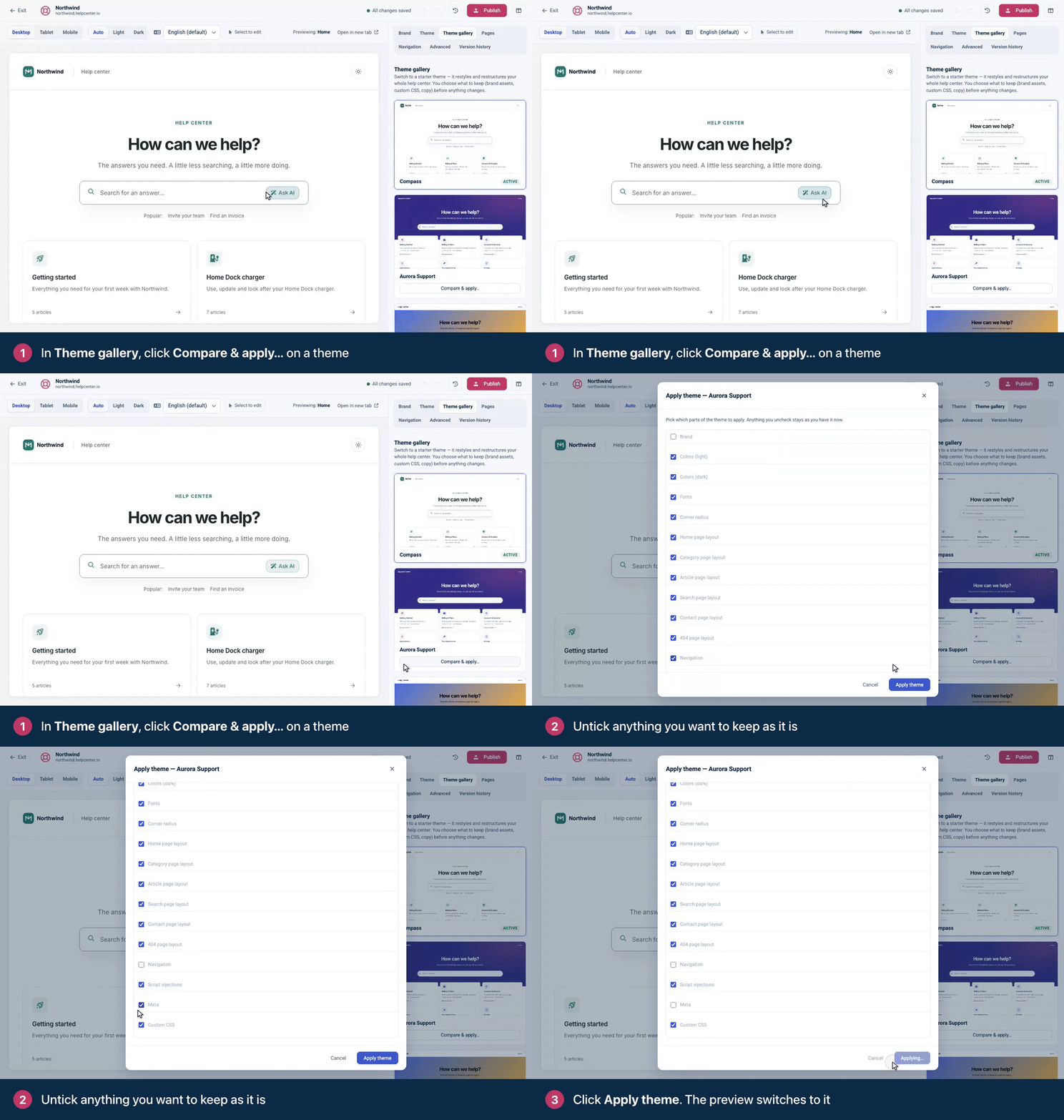
Before you apply, read Choose a theme: it explains which parts to untick so you keep your logo, contact form, analytics and SEO settings.
Comments
Be the first to comment.