

Components are the building blocks of your pages: the hero, the search bar, category grids, article lists, the contact form and more. Add them to any page, put them in the order you want and fine-tune each one.
Who can do this: Owners and Admins (Editors through Customize on your help center) · Plans: All plans
Add a component
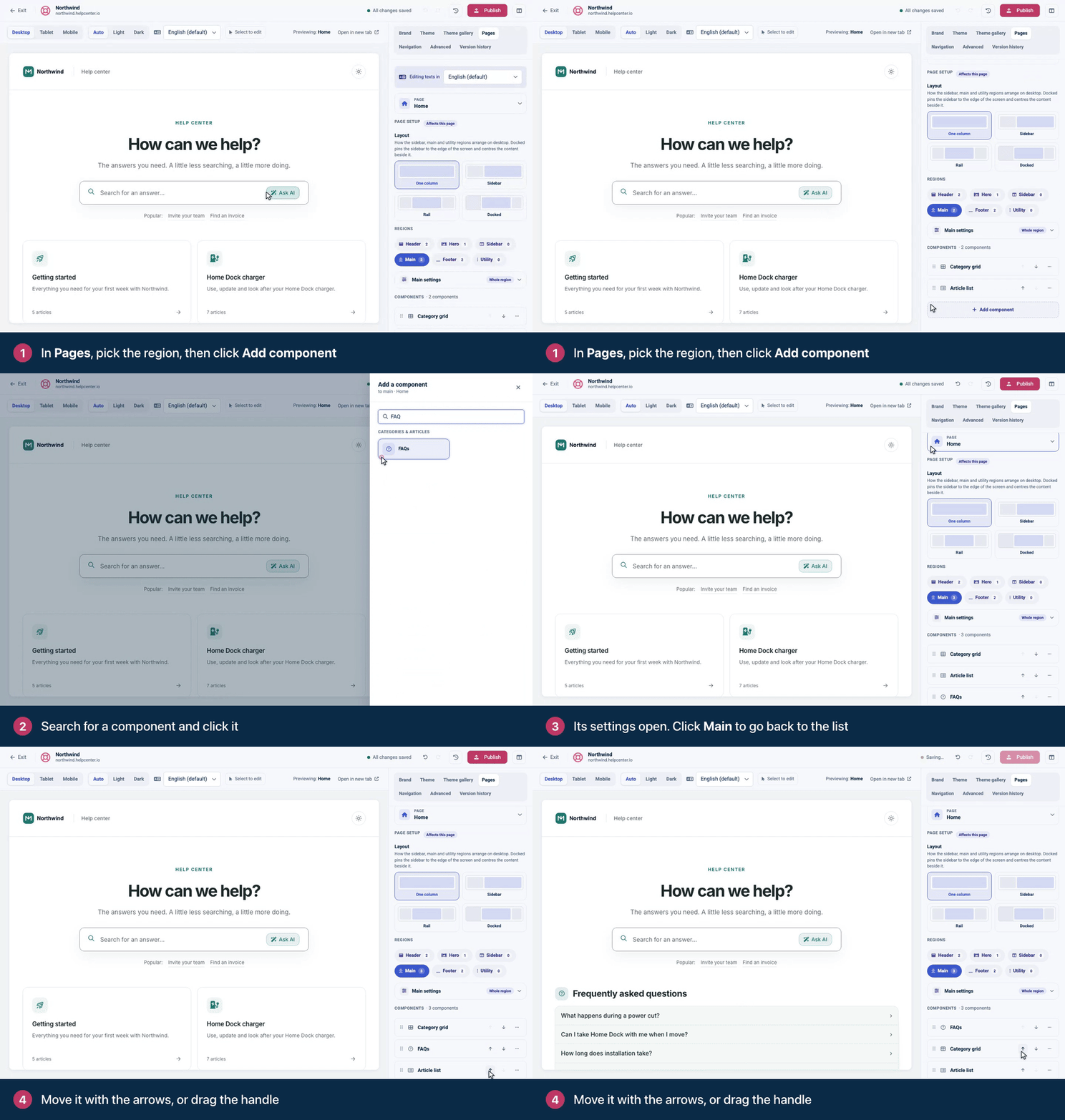
In the template editor, open the Pages tab (⌘4).
At the top, pick the page: Home, Category, Article, Search, Contact or Not found.
Under Regions, click where the component should go: Header, Hero, Sidebar, Main, Footer or Utility. The number on each region shows how many components it holds.
Click Add component.
In Add a component, search or browse the groups, then click the component you want. It's added at the end of the region and its settings open.
To get back to the region's list, click the region name at the top of the settings, for example Main.
The list only offers components that fit the page and region you picked. Some components can appear only once per region, such as the Search bar, Category grid, Logo and Footer. When the region already has one, it's dimmed and marked Already added.
On the Article page, the Main region is split into zones around the article, each with its own add button. See Customize the article page.
Move a component
Click the up or down arrow on its row.
Or drag it by the handle (⋮⋮) at the left of the row. With a keyboard, focus the handle, press Space to pick the component up, use the arrow keys to move it and press Space to drop it.
A Hero or Container can hold other components. Drag components into or out of it, or click Add inside Hero (or Add inside Container) under its list.
If a component snaps back, the editor tells you why, for example "Only one of those is allowed per area" or "That component can't go inside this container."
Edit, duplicate or delete
Click a component's name to open its settings. They're grouped into cards such as Content, Layout, Appearance, What to show and Behaviour. The Advanced card starts closed.
You can also turn on Select to edit above the preview and click the component there. See Edit text right in the preview.
The ⋯ menu on each row has Edit options, Duplicate and Delete. Duplicate puts a copy right below the original.
When you delete, confirm with Remove. Changed your mind? Press ⌘Z.
Width and position
In the Main region, each component has a Width: Full width or Half width. Two half-width components next to each other share a row.
Logo, Navigation, Search bar and Language switcher have a Position: Own row (block), or inline on the left, in the center or on the right. Inline components next to each other share one row, which is how a header puts your logo on the left and your menu on the right.
What you can add
Group | Components | Learn more |
|---|---|---|
Header & brand | Logo, Navigation, Language switcher, Search bar | |
Hero & layout | Hero, Container, Spacer, Divider | |
Categories & articles | Category grid, Article list, Featured articles, FAQs, Content tree | |
Article page | Breadcrumbs, Table of contents, Article metadata, Export menu, Was this helpful?, Comments, Related articles, Recently viewed, Share buttons | |
Content & forms | Rich text, Custom HTML, Contact form | |
Footer & social | Footer, Social links | |
Utility | Custom script | |
Other | Contact CTA |
Rich text takes Markdown. Custom HTML takes your own HTML, but any scripts and styles in it are removed: add scripts under Advanced → Script injections and styles under Advanced → Custom CSS.
A header or footer that is synced across all pages shows a change on every page. While you edit a component there, the label next to its name says All pages, or names the one page your change reaches, such as Home only. See Pages, regions and shared headers explained.
Troubleshooting
A component isn't in the list. It doesn't fit the page or region you picked, or it's a one-per-region component that's already there. The Table of contents, for example, goes in the Article page's Sidebar or Utility region.
A component shows in the preview but not on my help center. Publish your design. Some components also stay empty until they have something to show: Navigation needs links in the Navigation tab, and the Contact form, plus any Contact CTA that points to your contact page, stays hidden until the form has a recipient email.
I deleted the wrong component. Press ⌘Z right away. Undo covers your last 50 changes until you publish or reload the editor.
Comments
Be the first to comment.